November 10th, 2025
11 Best Data Visualization Tools for Analytics Dashboards in 2025
By Tyler Shibata · 16 min read
After testing dozens of platforms, these are the 11 best data visualization tools for analytics dashboards that help you see what’s working in 2025.
Expert take:
11 Best data visualization for analytics dashboard tools: At a glance
The right dashboard can make campaign results clear at a glance. Some tools highlight trends and insights, while others focus on automation and sharing. Here’s how the top 11 platforms compare in 2025:
Tool | Best For | Starting price (billed annually) | Key advantage |
|---|---|---|---|
Fast, conversational insights | Turns natural language questions into shareable visual dashboards | ||
Enterprise visualization | $75/user/month for the Creator license | Deep customization and AI forecasting for large datasets | |
Microsoft ecosystem users | Tight Microsoft 365 integration and strong financial analytics | ||
Google marketing data | Free | Connects Google Ads, Analytics, and Sheets in one live dashboard | |
Complex data exploration | $200/month for 10 users | Associative engine reveals links across multiple datasets | |
Embedded analytics | In-chip analytics for faster interactive dashboards | ||
Developer BI teams | $800/month for 10 users | Semantic modeling and version control for reliable reporting | |
Non-technical startups | $100/month for 5 users | Simple, question-based analytics for quick team insights | |
Real-time monitoring | Strong time-series visualization and open-source flexibility | ||
Small business reporting | $48/month for 5 users | Drag-and-drop dashboards with forecasting and automation | |
Executive visibility | Unified dashboards for tracking company-wide performance |
1. Julius: Best for fast, conversational insights
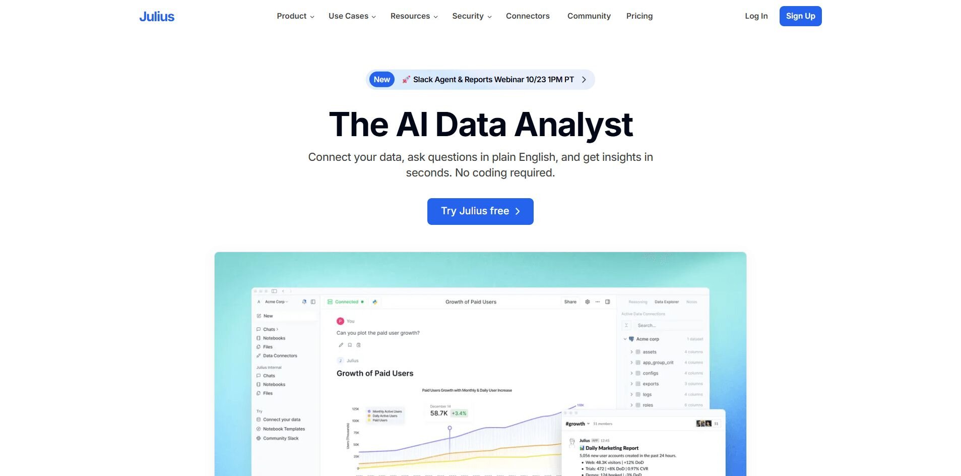
What it does: Julius is a data analytics tool that turns data questions into visual dashboards. You can connect sources like Google Ads, Snowflake, and Excel, then ask natural language queries to create charts, summaries, or reports in seconds.
Who it’s for: Business and marketing teams that need quick, reliable insights without SQL or analyst support.
We built Julius to help teams read performance data faster. Once your sources are connected, you can ask questions like “Which campaign had the highest ROI this month?” or “Where did conversion rates drop last week?” Julius returns an interactive chart instead of raw tables, so you can see trends clearly.
Each chart links directly to the underlying data, which makes it easier to confirm accuracy before presenting results.
For example, if a paid search campaign shows a spike in spend, you can trace it back to the exact ad group and keyword. That saves the time you would normally spend digging through multiple dashboards.
Recurring analyses can be saved as automatically refreshing Notebooks, Julius’ answer to confusing, one-off dashboards. You can use this to monitor weekly metrics like cost per lead, total ad spend, and regional conversions without manually updating reports. You can also push reports to Slack or email, keeping teams aligned without extra meetings.
Julius connects with the tools marketers already rely on, including Snowflake, Google Ads, and BigQuery. Over time, it learns how your connected data is structured, which helps it locate and join the right tables faster for more precise results.
Key features
Natural language analysis: Ask questions and get visual answers.
Connected data sources: Works with Google Ads, Snowflake, and Excel.
Automated reporting: Schedule reports for Slack or email.
Reusable Notebooks: Save recurring checks that auto-refresh.
Semantic learning: Improves query accuracy over time.
Pros
Simple setup for non-technical teams
Interactive charts update from live data
Reliable automation through Notebooks
Cons
Not built for deep statistical modeling
Works best with organized datasets
Pricing
Julius starts at $29.16 per month for the Plus plan.
Bottom line
Julius helps teams visualize data using natural language instead of SQL or static reports. It’s effective for marketers who want fast answers across ad spend, leads, and ROI. However, if your work involves predictive modeling or heavy data transformation, Tableau or Qlik Sense may be more suitable.
2. Tableau: Best for enterprise visualization
What it does: Tableau helps teams build dashboards that show performance trends clearly across multiple data sources. It connects to databases, spreadsheets, and cloud apps so you can see performance in one place.
Who it’s for: Larger teams that manage detailed or complex data and need advanced visuals.
I used Tableau to connect marketing, sales, and financial data into one workspace. It pulled campaign metrics from Google Ads, customer records from Salesforce, and revenue data from spreadsheets. That setup made it easy to see how ad spend is linked to sales outcomes across channels.
I found the drag-and-drop builder intuitive after a few uses, and grouping or filtering by region came easily. I also used Tableau’s forecasting feature to estimate quarterly revenue and test how budget changes could affect future results.
It’s powerful once configured, but smaller teams might find it heavier than necessary. Tableau works best when your data is organized and your team has time to explore and refine dashboards.
Key features
Interactive dashboards: Visualize live data across departments.
Forecasting tools: Estimate trends using built-in AI.
Data blending: Combine multiple connected sources.
Pros
Detailed visuals and flexible design
Handles large datasets well
Accurate forecasting
Cons
Longer learning curve
Higher pricing than lighter tools
Pricing
Tableau starts at $75 per user per month for the Creator license.
Bottom line
Tableau gives experienced teams a reliable platform for exploring and visualizing data. It’s built for analysis depth rather than simplicity, so smaller teams that want fast reporting might prefer Looker Studio or Zoho Analytics.
3. Power BI: Best for Microsoft ecosystem users
What it does: Power BI turns data from Excel, SQL, and Dynamics into dashboards and reports. It helps companies track budgets, performance, and KPIs inside Microsoft 365.
Who it’s for: Businesses that already use Microsoft tools and want analysis built in.
Power BI showed its strengths when I handled live campaign and budget data from Excel and Dynamics. Automatic refreshes kept dashboards current, and the familiar layout made results easy to review.
Learning DAX formulas took time, but added flexibility. They helped me create metrics like cost per acquisition and retention rate directly within reports. I also liked being able to publish dashboards to Teams for easier collaboration.
Power BI fits teams that already rely on Microsoft’s ecosystem and want shared access to consistent data. It’s practical for tracking both financial and marketing performance without switching tools.
Key features
Live dashboards: Refresh automatically from connected data.
Native integrations: Works with Excel, Dynamics, and Teams.
Data modeling: Create relationships and custom measures.
Pros
Easy for Microsoft users
Affordable starting price
Simple collaboration
Cons
Limited flexibility outside Microsoft
Some setup required for complex dashboards
Pricing
Power BI starts at $14 per user per month for the Power BI Pro plan.
Bottom line
Power BI works well for companies already invested in Microsoft’s ecosystem. It simplifies data sharing across departments. If most of your data sits in Google or third-party platforms, Looker Studio or Sisense may connect faster.
4. Looker Studio: Best for Google marketing data
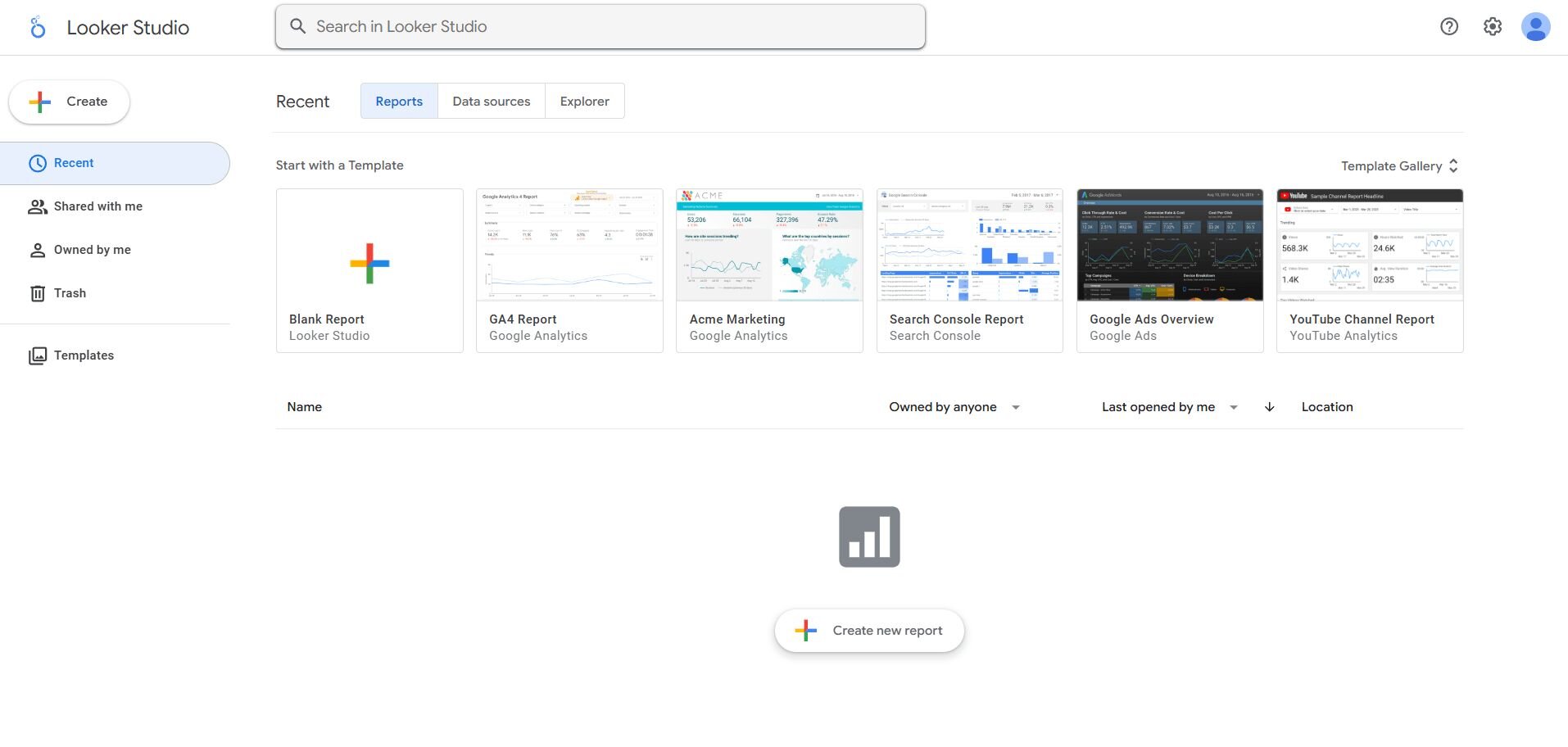
What it does: Looker Studio connects Google Ads, Analytics, and Sheets to build visual reports. It’s free and quick to set up.
Who it’s for: Marketing teams that manage campaigns in Google’s ecosystem.
I built several dashboards in Looker Studio for campaign tracking and client reporting. Connecting Ads and Analytics took minutes, and visuals updated automatically after each sync. I could view conversions, spend, and CPC in one place and share the report link directly with clients.
Filters made it simple to narrow results by date, campaign, or keyword. The visuals are clean but basic, which makes them best for tracking trends instead of deep analysis. Still, it’s quick enough for daily use and light enough for teams without technical support.
Looker Studio fits agencies and marketing teams that need to report on Google data regularly. It’s straightforward, especially for people who already manage campaigns inside Google Ads.
Key features
Google integrations: Connects to Ads, Analytics, and Sheets.
Shareable dashboards: Grant access through live links.
Templates: Start reports with prebuilt layouts.
Pros
Free and easy to use
Fast setup for campaign tracking
Simple sharing and collaboration
Cons
Basic visuals
Slower with large datasets
Pricing
Looker Studio is free to use.
Bottom line
Looker Studio is practical for marketers who live in Google’s ecosystem. It’s dependable for campaign summaries and client dashboards, but limited for analytics depth. If you want to bring campaign and sales data together in one view, Julius may be a better fit.
5. Qlik Sense: Best for complex data exploration
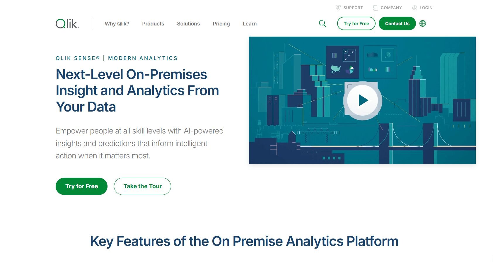
What it does: Qlik Sense uses an associative engine to explore large datasets interactively. It helps analysts see links between data points that traditional dashboards often miss.
Who it’s for: Data teams that handle high-volume or complex datasets.
When I tested Qlik Sense, I connected ad, sales, and CRM data to explore how campaigns affected customer value. It automatically linked shared fields, like customer IDs and product categories, and showed those relationships visually. That made it easier to understand performance patterns without writing queries.
The interface functions like a live data map where you can trace relationships between fields. You can click into visuals to pivot from region to product or campaign to revenue stream. It took setup time, but once configured, exploration was fast and accurate.
Qlik Sense suits analysts who work with detailed datasets and want control over how they explore data. It’s flexible enough for custom analysis and strong at uncovering insights others might overlook.
Key features
Associative engine: Finds links between datasets automatically.
Interactive visuals: Explore data through clicks and filters.
AI summaries: Generate written explanations of trends.
Pros
Reveals patterns standard dashboards miss
Works well with complex data
Responsive once configured
Cons
Requires onboarding time
More technical setup than basic tools
Pricing
Qlik Sense pricing starts at $200 per month for up to 10 users under the Starter plan.
Bottom line
Qlik Sense helps analysts explore how datasets connect through its associative engine, which links related fields automatically. It’s dependable for spotting patterns that basic dashboards can miss. Smaller teams may find Tableau or Metabase easier to manage.
6. Sisense: Best for embedded analytics
What it does: Sisense helps teams embed analytics into internal apps or client portals. It connects to data warehouses and lets you customize dashboards for different audiences.
Who it’s for: Product and operations teams that need analytics integrated into their own systems.
My goal with Sisense was to test how it handled client-facing analytics. I connected Snowflake and BigQuery, then embedded a live chart inside a web app to see how it performed and how customizable the layout was.
You can adjust colors, filters, and layouts for each audience, which helps tailor reports for different teams or clients. Setup requires some technical work, but once running, the dashboards stay secure and load quickly.
Sisense works well for teams that need control over embedded visual dashboards for clients or partners. For everyday internal reporting, lighter dashboard-building tools may be easier to manage.
Key features
Embedded analytics: Add dashboards within apps.
Data integration: Works with major cloud warehouses.
User roles: Manage access by audience type.
Pros
Strong customization
Secure client sharing
Scalable for analytics teams
Cons
Requires setup support
Higher cost for small companies
Pricing
Sisense offers custom pricing based on deployment scale.
Bottom line
Sisense gives developers the flexibility to control how users view analytics. It’s a solid fit for embedded reporting, but smaller teams that only need quick insights may prefer Metabase or Zoho Analytics.
7. Holistics: Best for developer BI teams
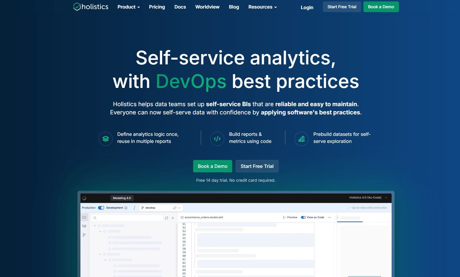
What it does: Holistics is a modeling-first BI platform that lets analysts define logic in SQL and reuse it across reports. It focuses on version control and automation.
Who it’s for: Data teams that build and maintain analytics models internally.
Using Holistics, I set up automated reports for a finance team that needed daily revenue summaries. Defining metrics in SQL saved time later since those same definitions applied across every chart.
The platform enforces consistency by using a shared data model. Once metrics like revenue or profit margin are defined, every report pulls from the same logic automatically. This keeps results aligned with data visualization best practices by standardizing visuals and reducing errors.
Holistics suits companies that already have analysts comfortable with code. It’s less flexible for beginners but dependable for managing recurring BI dashboard reports at scale.
Key features
SQL modeling: Define and reuse data logic.
Version control: Track and restore prior reports.
Automated delivery: Send updates on schedule.
Pros
Reliable data consistency
Developer-friendly workflow
Strong documentation control
Cons
Requires SQL knowledge
Limited design options
Pricing
Holistics pricing starts at $800 per month for the Entry plan, which includes 10 users,
Bottom line
Holistics is a stable choice for data teams that prefer coding over drag-and-drop tools. For visual exploration or faster setup, Tableau or Julius may be a better match.
8. Metabase: Best for non-technical startups
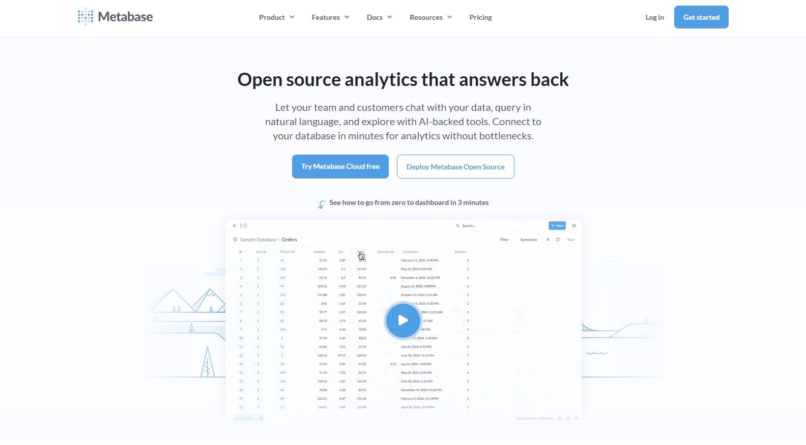
What it does: Metabase helps teams query data and build dashboards without SQL. It connects to databases like Postgres, MySQL, and BigQuery.
Who it’s for: Startups and small teams that want accessible reporting without technical setup.
I connected Metabase to a Postgres database and built charts using simple questions like “How many signups this week?” It generated color-coded graphs I could save as data dashboards and reports for quick sharing.
Scheduling reports by email kept teams updated automatically, and permission controls made it easy to protect sensitive data. Those features made reporting easier to manage without adding extra complexity.
Metabase stays lightweight and easy to maintain. It lacks advanced data visualization techniques, but its clarity and simplicity make it one of the top data visualization tools for smaller teams.
Key features
Question builder: Create charts without code.
Scheduled emails: Send reports automatically.
User controls: Restrict access by role.
Pros
Fast setup
Easy for non-technical users
Free to start
Cons
Limited analytics depth
Fewer visual styles
Pricing
Metabase starts at $100 per month for the first 5 users.
Bottom line
Metabase keeps reporting simple and approachable. It’s a good fit for small companies that need quick insights, but for more advanced analysis, Holistics or Qlik Sense may be more powerful.
9. Grafana: Best for real-time monitoring
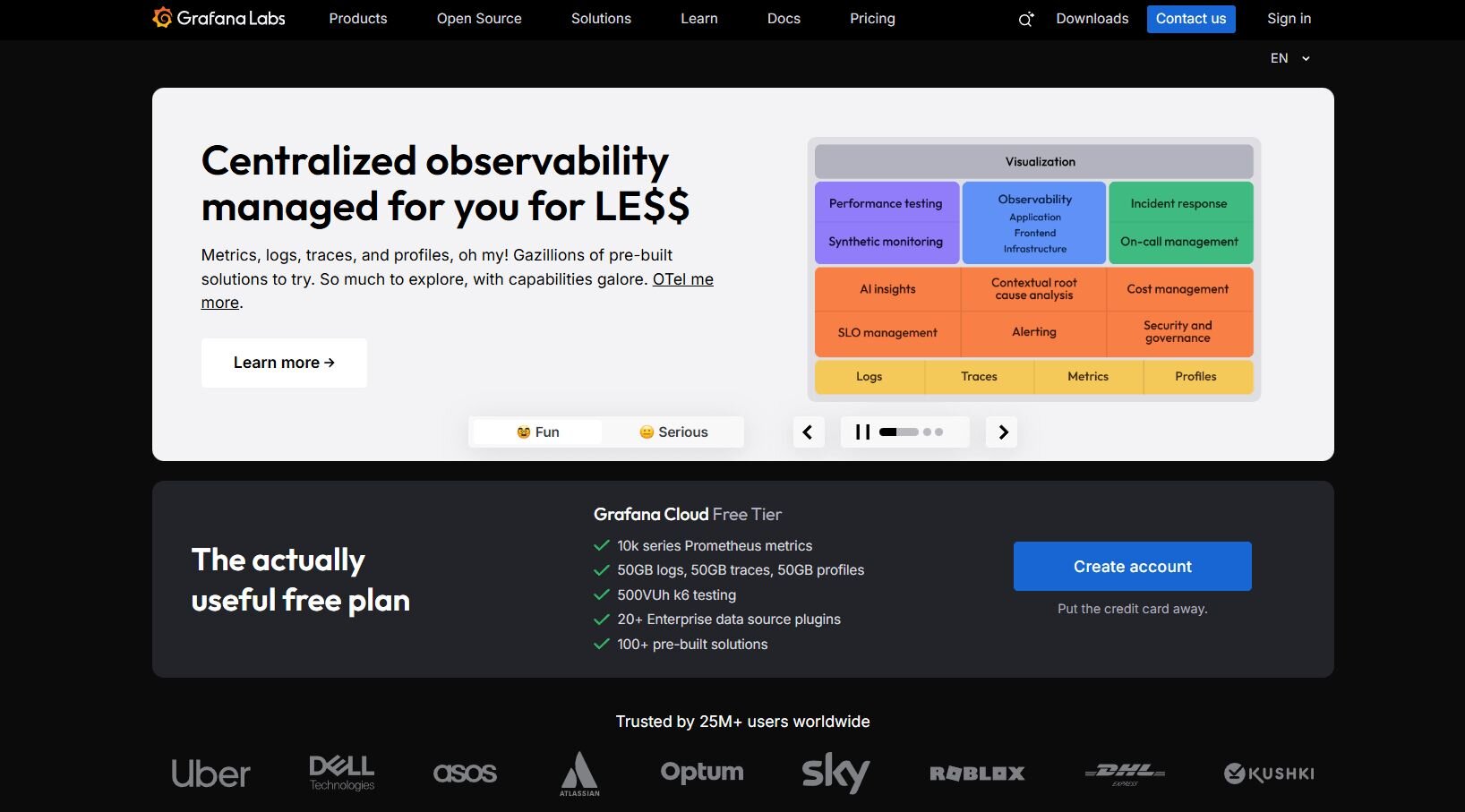
What it does: Grafana tracks metrics and system health in real time. It connects to APIs, databases, and cloud infrastructure for live reporting.
Who it’s for: Engineering and DevOps teams that monitor performance continuously.
I tested Grafana to track server uptime and user activity across environments. The dashboards refreshed in real time, showing spikes and slowdowns as they happened.
Each chart updates automatically, with alerts that trigger through Slack or email when metrics exceed set limits. The dashboard layout keeps charts organized, making it easy for technical teams to focus on key metrics.
Grafana needs technical skills to configure, but it’s reliable once active. It’s a consistent data visualization platform for system visibility, though it’s not built for business metrics or campaign tracking.
Key features
Live updates: Display real-time performance metrics.
Alert system: Notify teams of key events.
Plugin library: Extend visualization options.
Pros
Strong real-time monitoring
Supports diverse data sources
Reliable alerting
Cons
Requires technical setup
Less suited for business reports
Pricing
Grafana starts at $19 per month, plus usage costs.
Bottom line
Grafana provides steady visibility into system performance, helping teams catch downtime before it spreads. It’s suited for technical users who prioritize uptime and monitoring. Business teams may find Julius or Power BI more practical for campaign data.
10. Zoho Analytics: Best for small business reporting
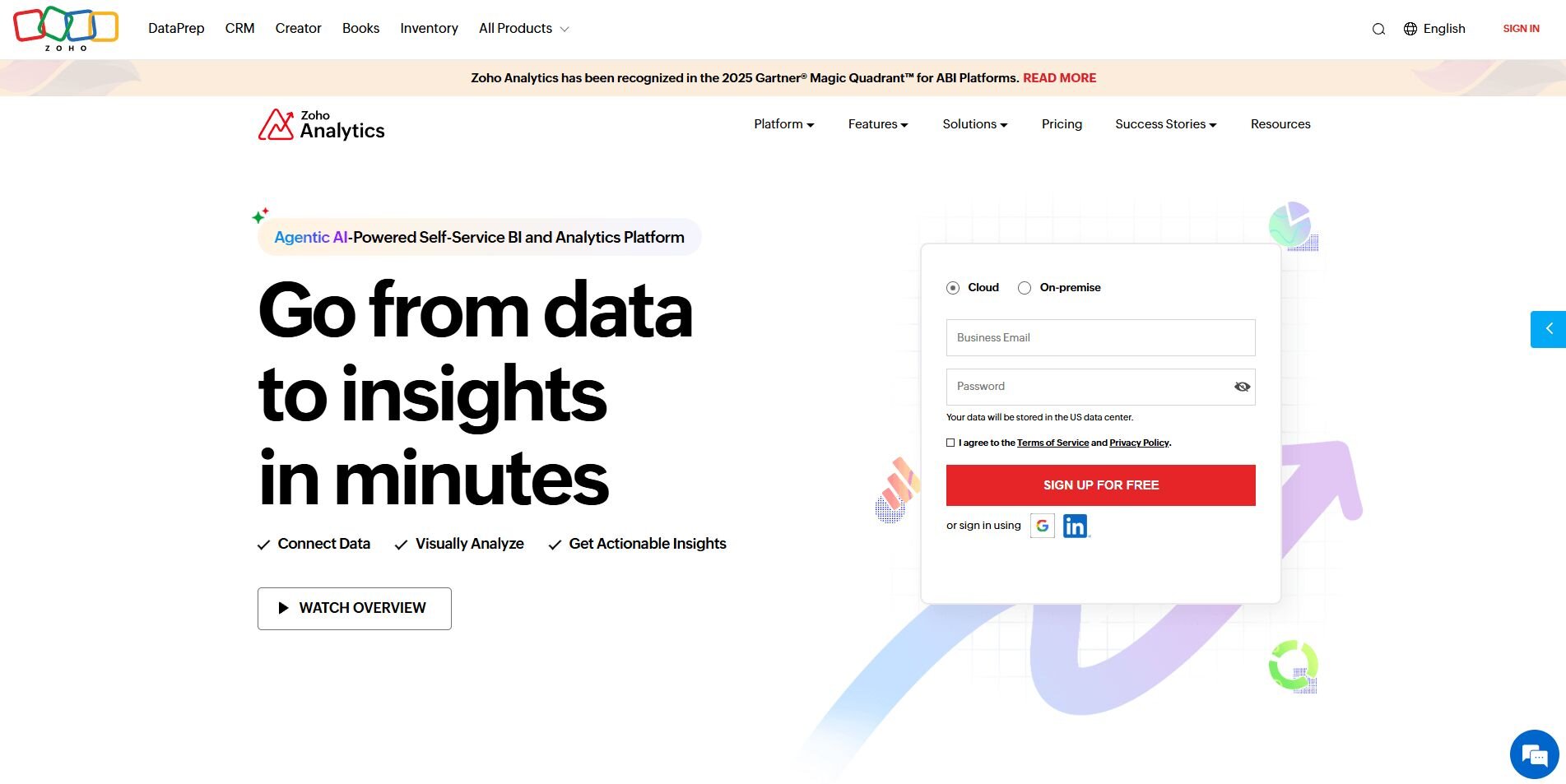
What it does: Zoho Analytics combines analytics, forecasting, and reporting in one tool. It connects to CRMs, ad platforms, and spreadsheets.
Who it’s for: Small and mid-size businesses that need clear reporting and automation.
I used Zoho Analytics to compare leads and conversions from CRM and ad data. The platform organized results clearly and made it easy to share reports securely through links.
Its automation refreshed weekly updates and applied AI-generated chart suggestions that sped up report prep. Zoho’s approach to data mapping kept everything structured, so the numbers stayed consistent across teams.
Zoho Analytics slows down with larger files, but it’s dependable and affordable. It suits businesses that want simple, repeatable insights without needing to maintain complex reporting systems.
Key features
Data preparation: Merge and clean sources automatically.
AI suggestions: Recommend visuals for reports.
Collaboration: Share dashboards securely.
Pros
Affordable pricing
Good automation options
Easy sharing
Cons
Limited with big datasets
Basic visuals
Pricing
Zoho Analytics Cloud plans start at $48 per month for five users.
Bottom line
Zoho Analytics suits teams that want organized, recurring reports at a reasonable cost. For faster analysis or conversational exploration, Julius may be a better fit.
11. Domo: Best for executive visibility
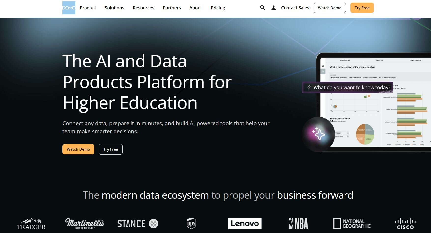
What it does: Domo combines analytics and collaboration in one workspace. It centralizes performance tracking for departments across the company.
Who it’s for: Executives and managers who need a single overview of company metrics.
I connected ad spend, revenue, and customer engagement data in Domo to create company-wide summaries. The automation tools refreshed data daily and distributed results to department heads for review.
Templates made dashboard setups quicker, but customization was limited. The platform keeps metrics clear and easy to compare across teams, which helps when different departments track performance in separate ways.
Domo works well for leadership visibility but lacks flexibility for deeper analysis. It’s dependable for executive scorecards that track revenue, pipeline, and Net Promoter Score on a fixed layout.
Key features
Company-wide dashboards: Summarize metrics for executives.
Automation: Refresh and distribute reports automatically.
Templates: Simplify report setup.
Pros
Great for top-level summaries
Consistent automation
Simple interface
Cons
Limited design flexibility
Expensive for small teams
Pricing
Domo provides custom pricing depending on your needs.
Bottom line
Domo is a strong fit for leadership teams that need consistent performance summaries across departments. If you want more room for hands-on analysis, Power BI or Tableau may complement Domo’s high-level reporting well.
How I tested these data visualization tools
I’ve spent years working with analytics teams, marketing departments, and leadership groups that depend on dashboards for daily decisions.
To build this list, I revisited tools I’ve used across real client projects and internal reporting systems. I also tested some new ones to see how they’ve evolved and whether they could compete with established options.
I tested each platform by:
Connecting real data sources: I linked tools like Snowflake, Google Ads, and CRMs to evaluate connection speed, data freshness, and stability.
Building visual dashboards: I recreated existing company reports to compare how each tool handled formatting, drill-downs, and shared access.
Reviewing automation and collaboration: I checked how well each system refreshed data, sent scheduled reports, and managed user permissions.
Measuring usability: I noted how long it took to create a report from scratch, how intuitive the interface was, and how much technical skill was required.
Comparing costs and scalability: I considered the entry price, data limits, and whether the platform could grow with larger teams or datasets.
Some tools performed better for quick, visual reports, while others stood out for customization and governance. These parameters helped me see where each platform fits best, from quick reporting to large-scale data management.
Which data visualization tool should you choose?
Your decision depends on how your organization handles data visibility. Teams focused on campaign reporting or finance might lean toward visual dashboards, while engineering and data teams often need deeper control. Choose:
Julius if you want conversational analysis that turns questions into visuals without SQL or complex setup.
Tableau if you manage large datasets and need advanced forecasting or deep customization.
Power BI if your data lives in Microsoft 365 and you want real-time updates through Excel or Teams.
Looker Studio if your reporting revolves around Google Ads and Analytics and you need an easy, free option.
Qlik Sense if you work with complex datasets and need associative exploration to uncover hidden links.
Sisense if you embed analytics into client portals or want custom dashboards for external stakeholders.
Holistics if your team codes in SQL and wants full control over data modeling and governance.
Metabase if you’re a small team that wants quick answers and reports without technical setup.
Grafana if you monitor live systems and need instant visibility into performance data.
Zoho Analytics if you run small-business reporting and want affordable automation with built-in AI suggestions.
Domo if your leadership team wants consistent, company-wide summaries updated automatically each day.
My final verdict
Tableau and Qlik Sense handle deep, technical analysis. Power BI fits teams already using Microsoft 365, while Looker Studio simplifies reporting for marketers in Google’s ecosystem. Grafana covers live monitoring, and tools like Metabase and Zoho Analytics make quick reporting accessible for smaller teams.
Julius stands out for making analysis fast and approachable. It connects to existing data sources and turns questions into clear visuals that can be shared easily. There’s no need for SQL or a complex setup to explore performance, compare campaigns, or build reports that refresh automatically.
For data engineers, Holistics and Sisense still lead in control and customization. But for everyday analysis across marketing, finance, and operations, Julius delivers the right balance of speed, accessibility, and accuracy.
How Julius can help with data visualization for analytics dashboards
The best data visualization for analytics dashboards starts with tools that make data clear and accessible. Once your data is connected, you need a platform that turns information into visuals you can act on.
Julius lets you connect live sources, ask questions in plain English, and get visual answers. Its features include interactive charts, scheduled reports, and Notebook-style summaries that help you track performance without switching tools.
Here’s how Julius helps with visualization and analysis:
Quick single-metric checks: Ask for an average, spread, or distribution, and Julius shows you the numbers with an easy-to-read chart.
Built-in visualization: Get histograms, box plots, and bar charts on the spot instead of jumping into another tool to build them.
Catch outliers early: Julius highlights values that throw off your results, so decisions rest on clean data.
Recurring summaries: Schedule analyses like weekly revenue or delivery time at the 95th percentile and receive them automatically by email or Slack.
Smarter over time: With each query, Julius gets better at understanding how your connected data is organized. That means it can find the right tables and relationships faster, so the answers you see become quicker and more precise the more you use it.
One-click sharing: Turn a thread of analysis into a PDF report you can pass along without extra formatting.
Direct connections: Link your databases and files so results come from live data, not stale spreadsheets.
Ready to build clearer dashboards faster? Try Julius for free today.
Frequently asked questions
What is the best data visualization tool for analytics dashboards?
The best tools for analytics dashboards are Tableau, Power BI, and Julius because they combine flexibility, clarity, and automation. Tableau handles complex visual modeling, Power BI integrates tightly with Microsoft 365, and Julius delivers fast, accurate insights from connected data sources.
How do data visualization tools help analytics teams?
Data visualization tools help analytics teams turn raw data into charts and dashboards that reveal performance trends. They make metrics easier to interpret, so you can spot problems, compare results, and share insights faster across departments.
What features should you look for in a data visualization platform?
Look for tools with real-time data connections, customizable charts, automation, and collaboration features. These features help you keep dashboards accurate, save time on reporting, and ensure everyone works from the same live data.
Can small teams use data visualization software effectively?
Yes, small teams can use data visualization software like Julius, Metabase, Zoho Analytics, or Looker Studio effectively. These tools are affordable, simple to set up, and include templates that make it easy to build dashboards without technical skills.
